What Colors Go With Orange? – Color Schemes That Feature Orange
This post may contain affiliate links. We may earn a small commission from purchases made through them, at no additional cost to you.
What came first, the fruit or the color? We might not be able to answer this, but we can help you consider this seemingly daunting color as a very viable interior design option. Orange is the color of autumn, citrus, Indian spices, and African sunsets. Orange may not be the first color you gravitate towards when it comes to interior design and décor, but in our opinion, it should be. To make designing with orange as effortless as possible, we’re going to have a look at a few color combinations for orange that take into consideration color theory as well as a bit of color psychology.
Orange Color Combinations
Orange is known to be a secondary color to the primary colors of yellow and red. This fact alone says a lot about orange, as yellow and red are known to be colors that are used plenty in the food industry. The reason for this is that red imitates hunger, and yellow signifies happiness.
Equal portions of red and yellow will bring about bright orange. Adding more yellow will result in a very light and almost neon orange. Adding more red will create a darker, moody orange. By using orange against a dark or moody backdrop, you can inject a feeling of energy and warmth into what could otherwise be an overwhelmingly gloomy room. Color psychology suggests that orange is a very uplifting, socializing color that can spark productivity.
Colors that go with orange can be found by looking at the color wheel and selecting orange’s complementary color, monochromatic colors, analogous colors, and triadic colors.
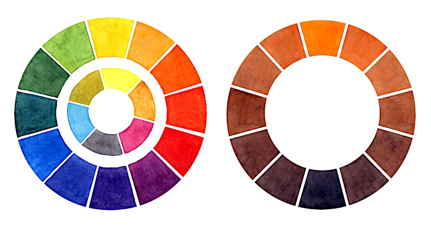
It is important to note that in the examples below, true orange will be used. There are many different tones and variations of true orange, and each combination differs accordingly.
Monochromatic Colors
Monochromatic colors refer to colors that are the same but have different shades and tones to them. This works great when you don’t want to create too much of a stark contrast in a room, but rather want a cohesive theme throughout. Monochromatic colors work great against a neutral color pallet and can be as loud or as toned down as you choose, because there are endless combinations.
| Shade | Orange Hex Code | CMYK Orange Color Code (%) | RGB Orange Color Code | Color |
| Orange #1 | #FFA500 | 0, 35, 100, 0 | 255, 165, 0 | |
| Orange #2 | #CC8500 | 0, 35, 100, 20 | 204, 133, 0 | |
| Orange #3 | #805300 | 0, 35, 100, 50 | 128, 83, 0 |
Analogous Colors
Analogous colors can be found adjacent to each other on the color wheel. In the case of orange, yellow-orange, and red-orange and all their shades are analogous colors. When used together, this color combination creates a sense of harmony and rhythm, most likely because it can be seen in nature, and in this case – sunsets.
| Shade | Orange Hex Code | CMYK Orange Color Code (%) | RGB Orange Color Code | Color |
| Orange | #FFA500 | 0, 35, 100, 0 | 255, 165, 0 | |
| Yellow-Orange | #FFDB0D | 0, 14, 95, 0 | 255, 219, 13 | |
| Red-Orange | #FF6B0D | 0, 58, 95, 0 | 255, 107, 13 |
Complementary Colors
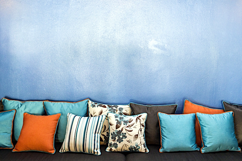
Complementary colors can be found directly opposite each other on the color wheel. This means that cool and warm colors are placed beside one another, and this creates a sense of balance. These colors, although complementing, are stark contrasts and should be used very skillfully for them not to look chaotic. Using complementary colors of the same tonal value can be very straining on the eyes. The complementary color to orange is blue. In this case, rather opt for a softer, pastel blue to complement the orange or a very dark navy blue.
| Shade | Hex Code | CMYK Color Code (%) | RGB Color Code | Color |
| Orange | #FFA500 | 0, 35, 100, 0 | 255, 165, 0 | |
| Blue | #0070FF | 0, 112, 255 | 100, 56, 0 |
Split Complementary Colors
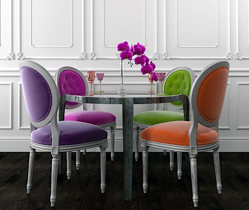
Split complementary colors are on each side of the main colors complementary color. There is a bit more variation with choosing this option and it can result in very interesting combinations when the correct hues are chosen. The split complementary colors of orange are blue-purple on one side and blue-green on the other side. These three colors together should be kept to a minimum, but are great accent colors for orange when used against a neutral pallet or when used together with orange décor.
| Shade | Hex Code | CMYK Color Code (%) | RGB Color Code | Color |
| Orange | #FFA500 | 0, 35, 100, 0 | 255, 165, 0 | |
| Blue-Purple | #220DFF | 87, 95, 0, 0 | 34, 13, 255 | |
| Blue-Green | #0DF7FF | 95, 3, 0, 0 | 13, 247, 255 |
Triadic Colors
Triadic colors form a perfect triangle in relation to the main color on the color wheel. When true orange is used, this creates a trio of very rich colors and should be used very sparingly in its true form. It is advised to pick one dominant color and use the other two colors only in small details, trims, or décor as accent colors for orange.
| Shade | Hex Code | CMYK Color Code (%) | RGB Color Code | Color |
| Orange | #FFA500 | 0, 35, 100, 0 | 255, 165, 0 | |
| Purple | #AB19FF | 33, 90, 0, 0 | 171, 25, 255 | |
| Green | #19FF85 | 90, 0, 48, 0 | 25, 255, 133 |
What Colors Go With Orange?
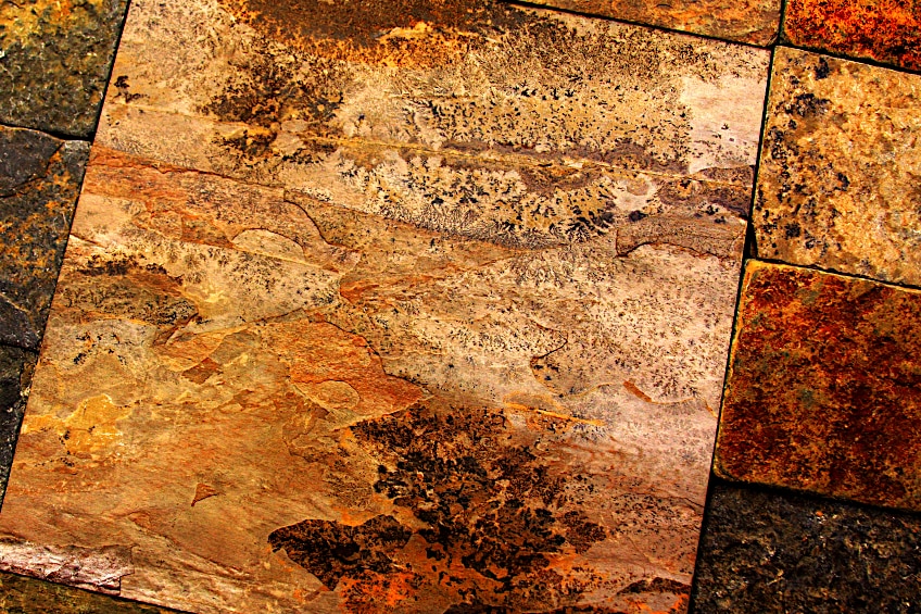
We hope that introducing the above color theories, proves that there are many colors that go with orange and there is no need for it to be as underutilized as it currently is in interior design. The different hues alone make it worth considering, all the way from dark rusted orange to a bright tangerine and light peach.
If you are still not convinced, maybe consider this: if the right shade of orange is used, it can even be considered as a neutral color. This neutral orange can then be used to further add complementary accents such as blue or purple, and in turn, make the complementary colors really pop. Imagine a very rich wood floor with an orange tint. Although not obvious, this still has tones of orange and will most likely still exude the psychological qualities of orange, if this is what you are after. Choosing a beige paint color for your walls with a hint of peach will create the same effect. Adding copper fittings and accessories to a space will also imitate the color properties of orange.
It is important to think of (and use) orange as a natural color – because it is. Orange shades can be seen as the neutral backdrop everywhere in nature, whether it be a sunset-filled sky, orange Sahara sands, or enormous rock mountains. Orange appears to be everywhere. If you are set on using bright orange in a room, rather stick with orange décor items such as pillows, throws, furniture, artwork, flowers, and so forth.

The energy and productivity that orange radiates make it a great color to consider for a work environment like a home office. Imagine a feminine peach-orange pallet with warm wood tones for the desk and shelving. Again, try to avoid bright orange here, as it has the potential to be overstimulating for this type of environment. If you are set on using bright orange in a working environment, focus the color on the floor in the form of an orange rug, for example. You can also introduce orange very subtly through artwork on a wall (still painting of a bowl of oranges). An arrangement of orange tulips on your desk will also do the trick.
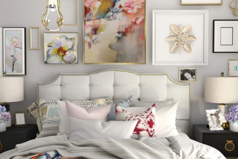
Brands like Nickelodeon used orange in their logo for its playful quality. Its playfulness makes orange a great color to use in a children’s playroom, where stimulation is also a bonus. Be wary of using bright orange in a child’s bedroom, as its overstimulating qualities may hinder their rest. Orange might be tempting to introduce in a nursery because of its gender neutrality, but rather consider light/pastel tones of orange or make use of it sparingly as part of a pattern on the duvet covers. The bright cheeriness of orange also makes it the ideal wake-up color for a child’s bathroom.
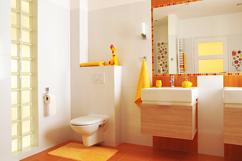
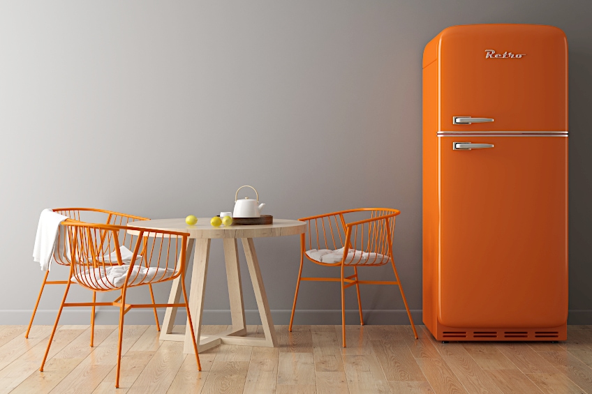
As previously mentioned, orange is known to stimulate the appetite. Some may consider this a negative quality, but orange specifically represents healthy foods like carrots, pumpkin, sweet potato, and citrus fruits. This might be your sign to bring orange (the color and the fruit) into your kitchen to kickstart healthy eating habits. Against a white backdrop, add warm orange wood tones, copper sink mixers, and maybe a few orange bar stools if you are feeling bold.
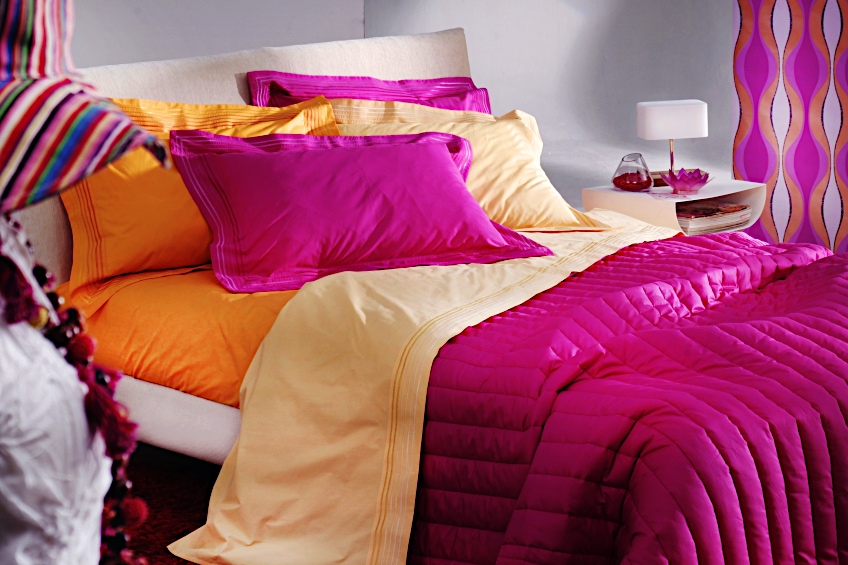
Orange and Pink
Pink may be one of the most unapparent colors that go with orange. This color combination is very popular in the design industry and for good reason. Pink is the far-end analogous color of orange, which means they are both warm colors because they share the primary red. Bright orange and hot pink look great next to each other. Setting off a bright orange with a light dust pink could look even better.
| Shade | Hex Code | CMYK Color Code (%) | RGB Color Code | Color |
| Bright Orange | #FFA500 | 0, 35, 100, 0 | 255, 165, 0 | |
| Hot Pink | #FA206E | 0, 87, 56, 2 | 250, 32, 110 | |
| Faded Orange | #F0A47D | 0, 32, 48, 6 | 240, 164, 125 | |
| Dusty Rose | #FA869A | 0, 46, 38, 2 | 250, 134, 154 |
Orange and Gray
A cool gray is a great neutral color to use together with orange because gray is so close to blue on the color wheel, which is the complementary color to orange. Orange furniture against a charcoal wall will complement and highlight the orange furniture at the same time.
| Shade | Hex Code | CMYK Color Code (%) | RGB Color Code | Color |
| Orange | #FFA500 | 0, 35, 100, 0 | 255, 165, 0 | |
| Faded orange | #F0A47D | 0, 32, 48, 6 | 240, 164, 125 | |
| Gray | #A3B3C2 | 16, 8, 0, 24 | 163, 179, 194 | |
| Charcoal | #7B8792 | 16, 8, 0, 43 | 123, 135, 146 |
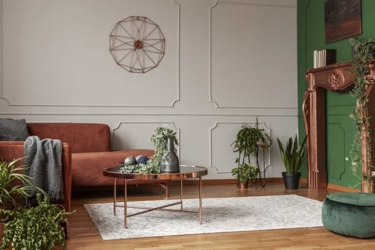
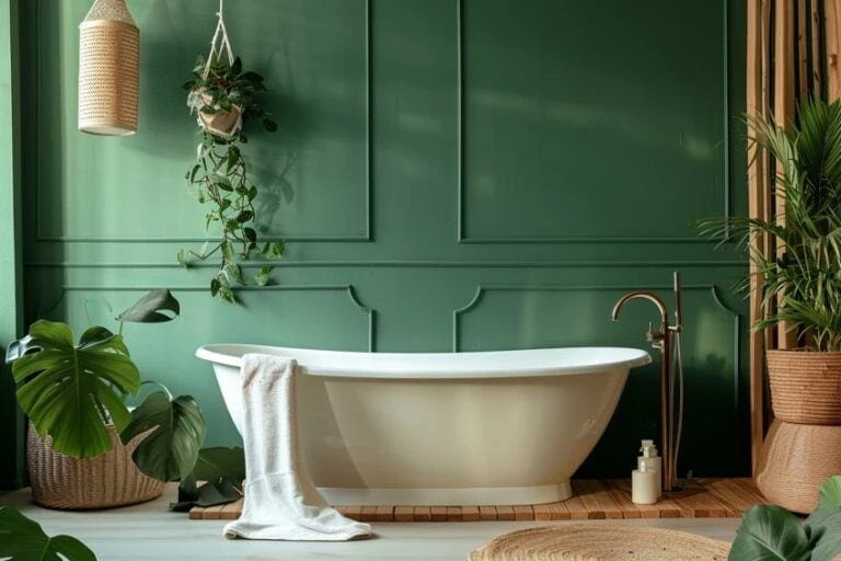
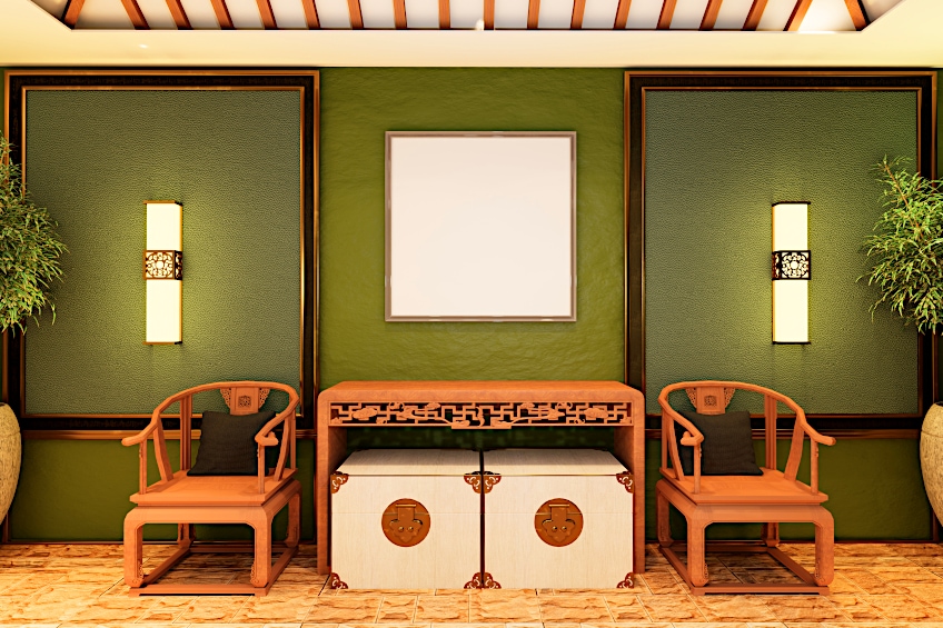
Orange and Green
Because orange is prominent in natural scenes, green is great to pair it with. Green is also the split complementary color to orange, which makes it a less obvious complementary color to combine with. Try to avoid bright greens with orange, and rather opt for darker, emerald greens.
| Shade | Hex Code | CMYK Color Code (%) | RGB Color Code | Color |
| Rust Orange | #D46A13 | 0, 50, 91, 17 | 212, 106, 19 | |
| Dark Green | #246642 | 65, 0, 35, 60 | 36, 102, 66 |
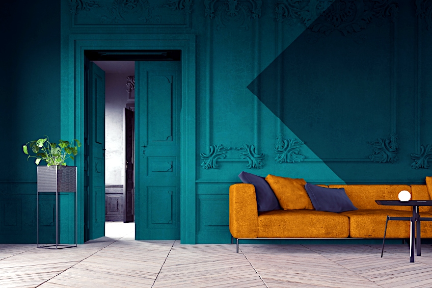
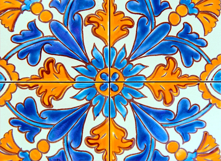
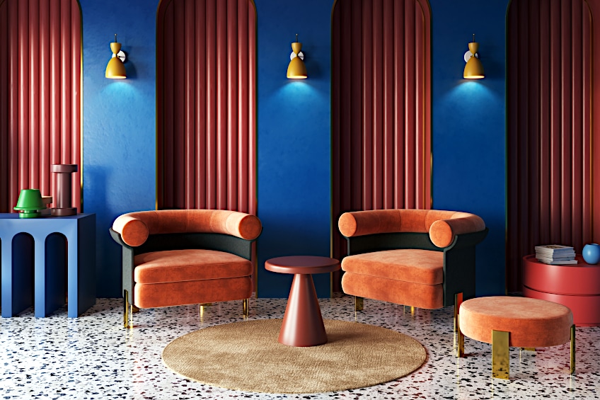
Orange and Blue
Blue is orange’s most obvious pair, as it’s the direct complementary color to orange. These two colors are very contrasting when used in the same hue. Try to use dark blues when using bright orange and/or lighter blues when using dark orange in order to place emphasis on one of the colors. Dark blue and dark orange will create a very dramatic effect, which is plausible in some cases if used correctly.
| Shade | Hex Code | CMYK Color Code (%) | RGB Color Code | Color |
| Orange | #FFA500 | 0, 35, 100, 0 | 255, 165, 0 | |
| Navy Blue | #000080 | 100, 100, 0, 50 | 0, 0, 128 |
Orange and Beige
Beige is a monochromatic color to orange. These two colors complement each other very well because both are warm colors and together, they exude a feeling of comfort. Most tones of orange work well against a neutral beige backdrop, most likely because we see these colors together in nature (think desert sunset).
| Shade | Hex Code | CMYK Color Code (%) | RGB Color Code | Color |
| Dirty Orange | #BF7441 | 0, 39, 66, 25 | 191, 116, 65 | |
| Beige | #D1C0A8 | 0, 8, 20, 18 | 209, 192, 168 |
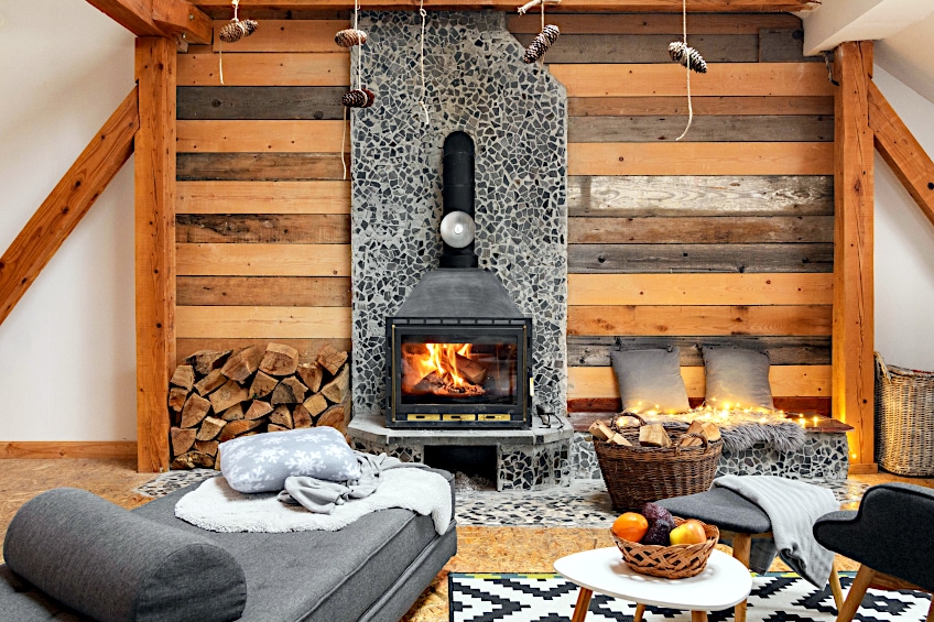
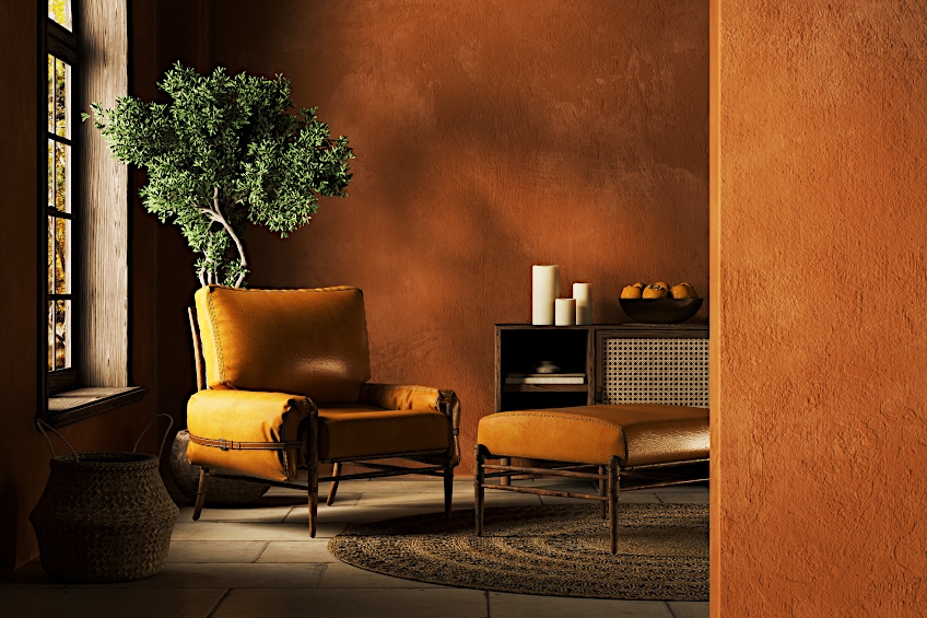
Orange and Brown
Orange and brown immediately take the mind to autumn leaves. Once again, nature speaks for itself. These two colors can be easily and naturally combined in any space, as brown can be seen abundantly as a default color in wooden furniture. These furniture pieces, combined with a few orange accessories make for a great combo when used in moderation. The type of orange used with brown is very important, as certain bright oranges together with brown can look very outdated. Rather opt for more of a red-orange like terracotta.
| Shade | Hex Code | CMYK Color Code (%) | RGB Color Code | Color |
| Terracotta | #D15637 | 0, 59, 74, 18 | 209, 86, 55 | |
| Brown | #52301D | 0, 41, 65, 68 | 82, 48, 29 |
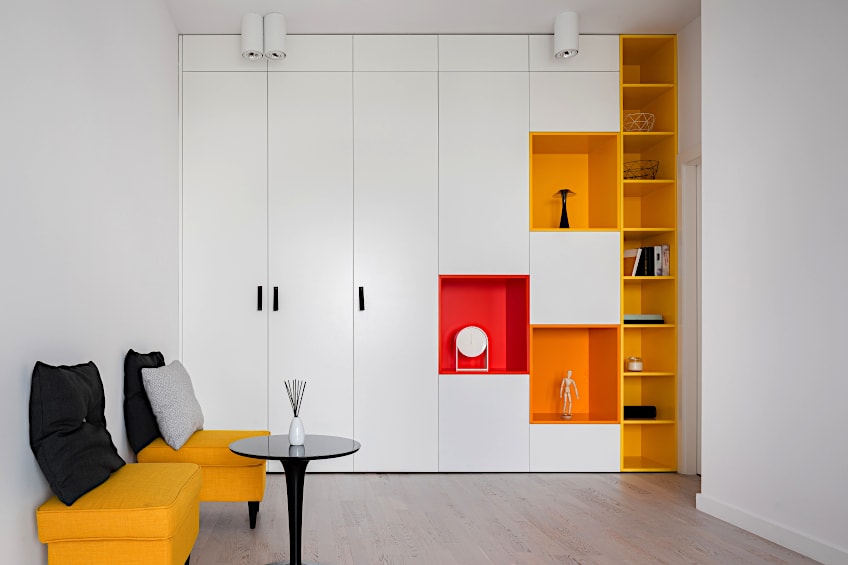
Orange and Black
Orange and black combined, give off a very contemporary look. Although a bold choice, this can be a great addition to a playroom where lots of stimuli are needed for early childhood development. A pop of bold orange against a black and white palette can also be striking in any room.
| Shade | Hex Code | CMYK Color Code (%) | RGB Color Code | Color |
| Orange | #F0852D | 0, 45, 81, 6 | 240, 133, 45 | |
| Black | #000000 | 0, 0, 0, 100 | 0, 0, 0 | |
| White | #ffffff | 0, 0, 0, 0 | 255, 255, 255 |
Orange is no longer the taboo that it was once considered to be in interior design. With the correct color combinations and shades, it can make for a very classy and trendy interior that can suit the needs of any space. Whether used as the main focus or in moderation, as the neutral color in a room or the focal pop of color, the fun, optimistic, and productive properties of orange will remain intact.
Frequently Asked Questions
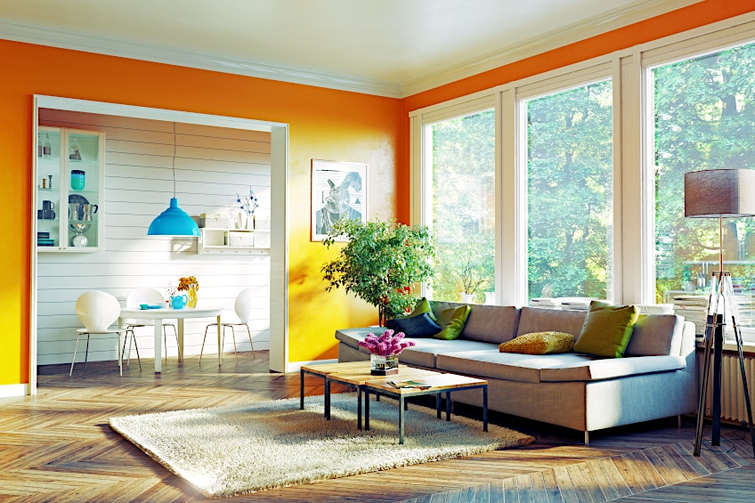
What Color Matches Orange Walls?
Moving into a rental with orange-toned walls throughout and wondering what color matches orange walls? It is always best to offset bright colored walls with neutral colors like black, white, creams, and so forth. If the orange walls are still too much of an eyesore for you, add a complementary blue furniture piece that will draw the eye away from the walls and balance things out a bit.
What Color Curtains Match Orange Walls?
It is best to steer clear of complementary or different toned curtains when you are working with orange walls. Choosing curtains with a contrast of color like blue, will color block the entire wall and make the space feel cluttered. If you want to purposely emphasize the orange walls, choose a monochromatic color for a very contemporary look. Coral curtains against orange walls could look great. If you really want to go full out with color, magenta curtains would be the way to go.
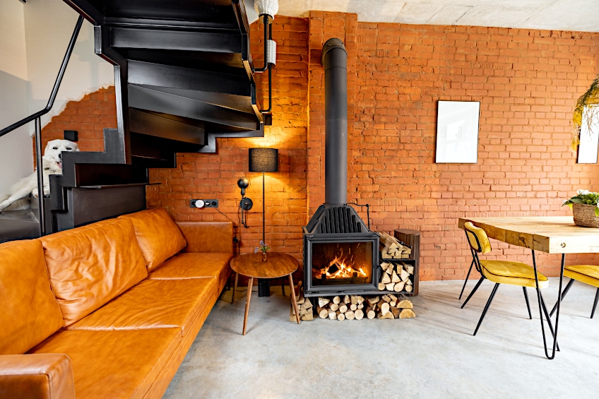
What Colors Go With a Burnt Orange Couch?
Again, this all depends on whether you want to make a statement with the entire room, or if you want to let the couch be the star of the show. If it’s the former, the answer to the previous two questions applies here as well. If it’s the latter, try to combine your bold orange couch with neutral wall colors and furniture, like black, white, and gray.
What Neutral Colors Work Best With Orange?
All neutrals complement orange quite well, but if there must be one that stands out, it must be gray. The reason for this is that blue is the complementary color of orange and gray is the closest neutral to blue. Orange accessories and furniture pieces go especially well with a cool, dark charcoal gray.
What Décor Goes With Orange?
Décor with warm colors such as red and yellow tend to go well with orange, depending on the specific shade of orange or whether you want to create a cohesive environment. If you want your décor to contrast and stand out against the orange color in the room, cool dark blues and purples are great accent colors for orange and could work well as décor items. Because green is the split complementary color to orange, plants work great as décor with orange walls, rugs, and furniture. The cool green of the plants will balance out a bright orange and result in a very cohesive environment.