What Colors Go With Blue? – How to Harmonize With Blues
This post may contain affiliate links. We may earn a small commission from purchases made through them, at no additional cost to you.
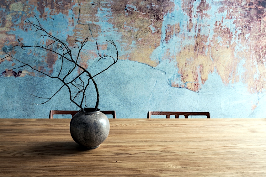
Blue is a color that is often associated with feelings of calmness and tranquility. But it can also make a space feel cold and depressing. If done correctly though, it can be a fun and versatile color to incorporate into your home. There are so many shades of blue that it can be hard to work out what works best in your space. To help make your choices a bit easier, let’s explore the colors that go with blue.
How to Find Great Color Combinations With Blue
Surveys worldwide have shown that blue is most people’s favorite color, which is no wonder given the huge variety of hues. Blue is also one of the three primary colors, along with red and yellow, which means that it is the base of many secondary and tertiary colors. This makes for an almost endless list of color combinations that include blue.
When deciding what colors to put in your home, the best thing to do is turn to the color wheel. The color wheel can be difficult to read at first, but as long as you follow a few rules it is really simple to use. The three primary colors form a triangular shape, with yellow at the top, blue on the left-hand point, and red on the right-hand point.
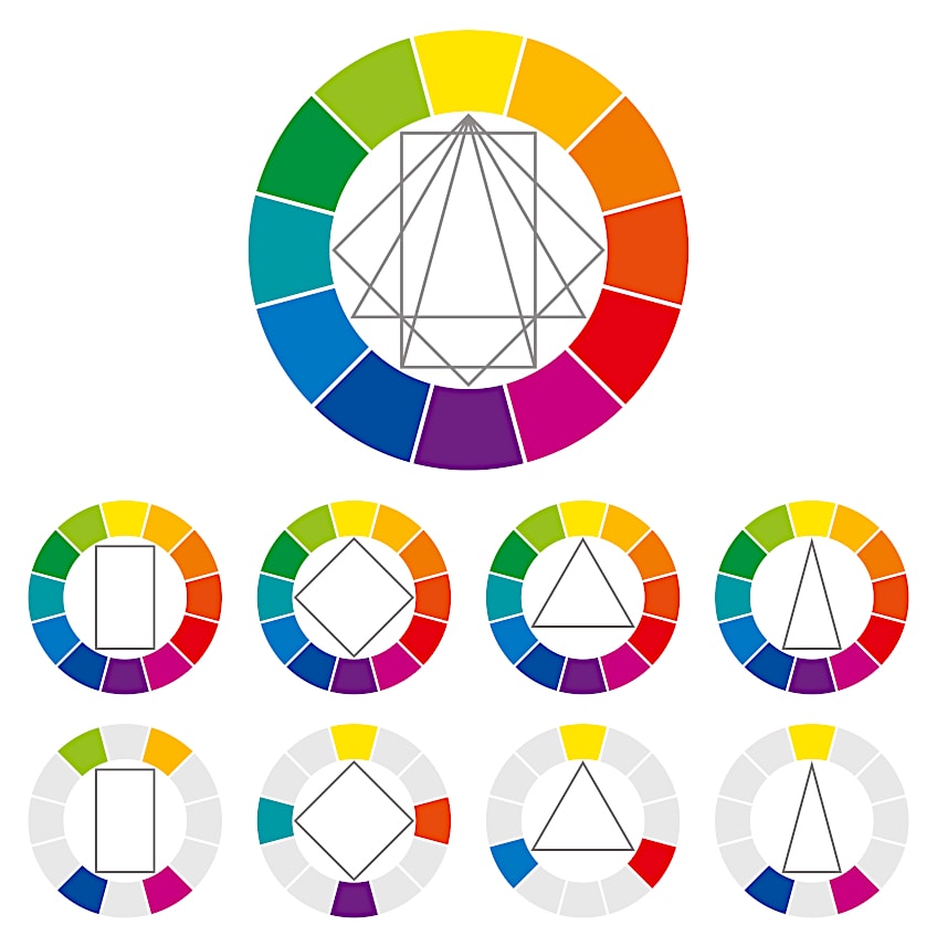
Between the points are the different shades created by mixing the colors together. So between blue and yellow will be varying shades of blue-green. The space between blue and red will contain shades of purple and pink. Finally, between red and yellow are shades ranging from a light red to a mustard yellow. These are called the secondary and tertiary colors.
One last thing to understand about the color wheel is that it can be divided into two. All of the cool colors, which are the different blue and green hues, are on one side. The other side is made up of reds, oranges, and yellows, which are warm colors. Knowing the temperature of different colors can help you create the atmosphere you desire for your space.
Complementary Colors to Blue
Complementary colors are the colors found diagonally opposite each other in the color wheel. Complementary colors visually work with one another because they create contrast, which is interesting and pleasing to the eye. The colors on either side of the complementary color, sometimes called split complementary colors, also work nicely with one another.
In this case, the complementary color of blue is orange because it is its opposite. This mixture of cool and warm tones makes for a balanced yet striking combination. If the idea of having bright blue and orange in your home decor scares you make use of split complementary colors. You can create a toned-down version by using a combination of pale blues and earthy orange tones.
| Shade | Hex Code | CMYK Color Code (%) | RGB Color Code | Color |
| Blue | #3358FF | 229, 80, 60 | 51, 88, 255 | |
| Orange | #FF8A33 | 25, 80, 60 | 255, 138, 51 |
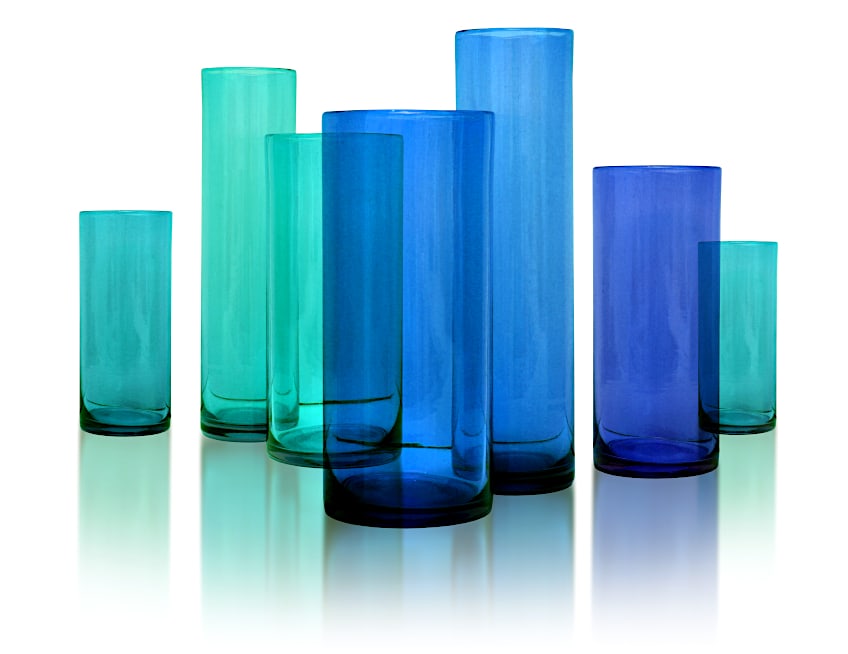
Monochromatic Colors
Using monochrome is a foolproof way to create a chic and put-together look. Blue is one of the easiest colors to use when employing monochrome because of the wide variety of hues to choose from. A useful tip when using a monochromatic color scheme is to choose blues with the same undertone. This way your choice of blue decor looks intentional and not just like you chose to do monochrome because you could not think of colors that complement blue.
Another useful tip when following a monochromatic color scheme is to use a variety of different textured fabrics and patterns in your furnishings. The easiest way to do this is through curtains, carpets, and accent pieces such as cushions. This keeps your decor looking fresh and exciting even though everything is one color. Adding texture and pattern through smaller furnishings also makes them easier to change up if you get bored or want to try something new.
| Shade | Hex Code | CMYK Color Code (%) | RGB Color Code | Color |
| Blue | #222FD7 | 235, 84, 49 | 34, 47, 215 | |
| Aqua | #00FFFF | 180, 100, 50 | 0, 255, 255 | |
| Teal | #008080 | 180, 100, 25 | 0, 128, 128 |
Analogous Colors
Analogous colors in simple terms are colors that are similar. When using this technique, you would typically make use of three colors. First, pick a primary color, then one of the secondary colors that is made from it. After that, all you have to do is look at the tertiary shade between these two colors and you have your set of three. This may sound a bit confusing but it is actually so simple to do and creates a really cohesive look.
Analogous colors that go with blue would be blue, blue-green, and green. If that combination does not appeal to you then look on the other side of your primary color. In this case, you could go for blue, blue-purple, and purple instead. You can create a number of different atmospheres using analogous colors in your home. The reason these colors all work so well together is that they each contain varying amounts of the same base color.
| Shade | Hex Code | CMYK Color Code (%) | RGB Color Code | Color |
| Blue | #222FD7 | 235, 84, 49 | 34, 47, 215 | |
| Blue-Purple | #620CEF | 263, 95, 49 | 98, 12, 239 | |
| Purple | #920CEF | 275, 95, 49 | 146, 12, 239 |
Triadic Colors
Triadic colors are another name for primary colors. Triadic colors are the building blocks that make up all other secondary and tertiary colors. For this reason, when we think about what colors go with blue, then red and yellow are both classic combinations. They create a simple yet bold look that is not as in-your-face as complementary color combinations.
Triadic colors can conjure up images of children’s rooms or brightly colored toys. Although this fun and eye-catching combination is often associated with children, it can also be pulled off in a way that is modern and chic. One of the ways to achieve this is to use only one or two of these triadic colors in their pure form while going for a more toned-downed version for the third. Another way is to add pops of other colors, like pink or green, to make for a less predictable look.
| Shade | Hex Code | CMYK Color Code (%) | RGB Color Code | Color |
| Blue | #222FD7 | 235, 84, 49 | 34, 47, 215 | |
| Red | #EF0C1D | 355, 95, 49 | 239, 12, 29 | |
| Yellow | #FEE304 | 54, 98, 51 | 254, 227, 4 |
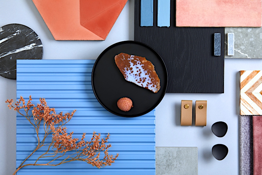
Colors That Go With Blue
Blue has been one of the most common colors used in interior design for decades. This is because there are so many different shades and so many colors that complement blue. Blue decor also works with a number of aesthetics. Whether you’re into traditional, modern, sophisticated or rustic, blue is the shade for you. Although timeless, Dulux’s color ‘Bright Skies’, being voted color of the year for 2022 shows how people are rushing to add some blue to their homes this year.
Blue is a color that is suitable for all rooms of the house. Incorporating even just a bit of it into each room can give your home a cohesive, structured feel. Although this certainly does not have to mean that your space looks boring or monotonous. There are so many colors that go with blue that you can keep each room looking fresh and exciting.
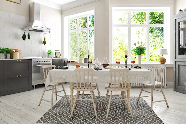
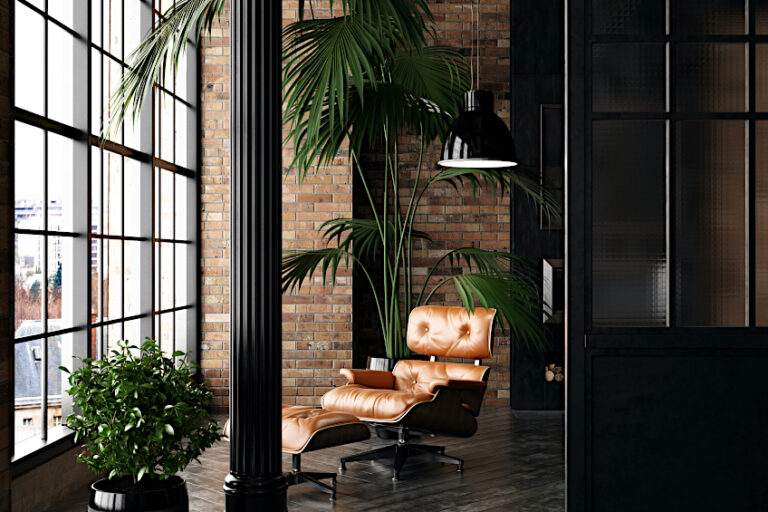
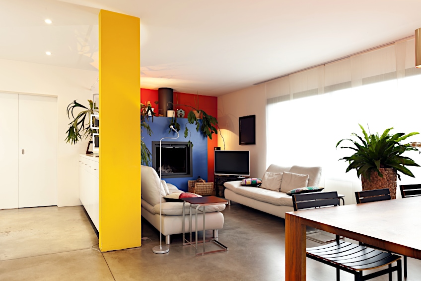
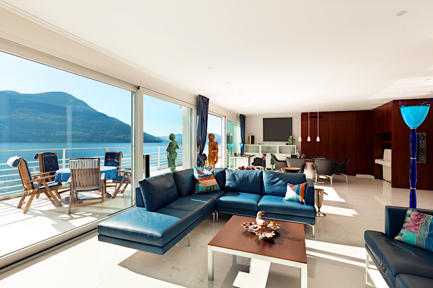
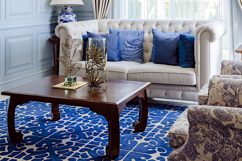
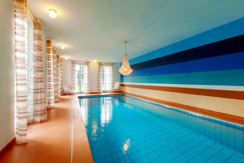
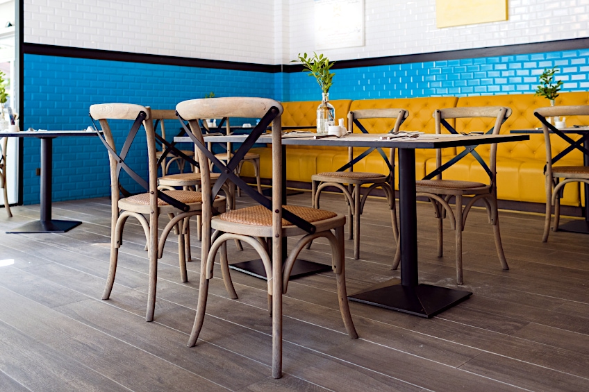
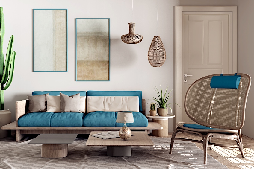
As mentioned above, blue works in every room of the house, so let’s start with the living room. Incorporating blue into your living room can seem daunting but it’s actually so easy to do. Choose blue walls that can be any shade from pale grey-blue to bright cobalt. The trick is to keep your furniture and flooring neutral so that you are not overwhelmed by color. For example, beige, taupe, or white couches and wooden flooring are a classical way to balance your bright walls. If blue walls are too intimidating, try swapping the color scheme and choosing a neutral tone for your walls, and going for a blue couch for a pop of color.
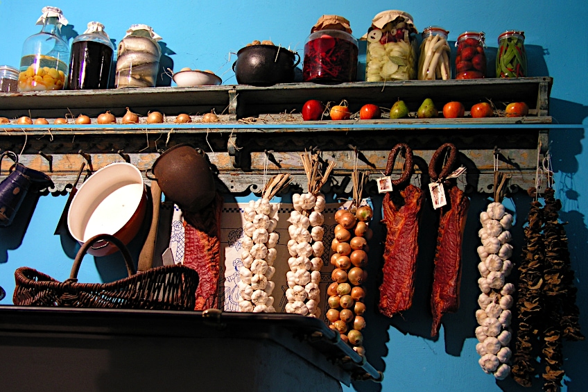
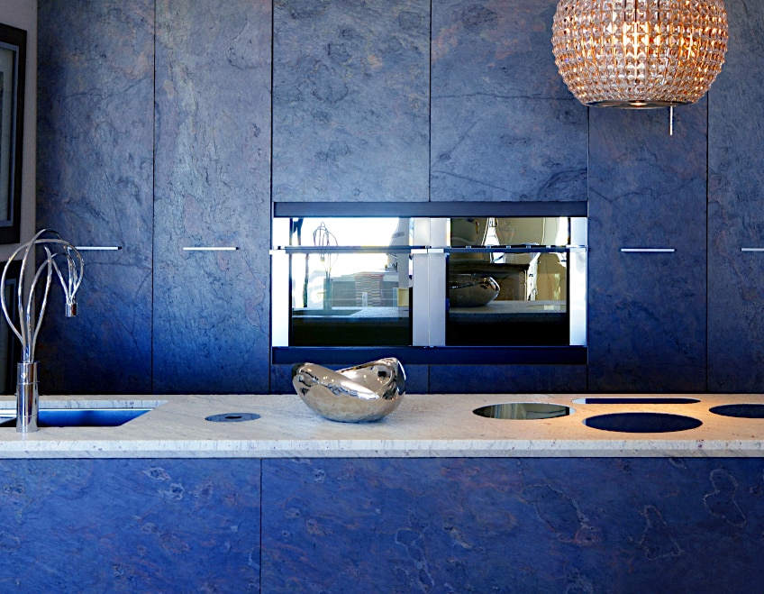
Although blue might not be the first color that springs to mind for a kitchen, blue kitchens were all the rage in the Victorian era. They believed that the color blue deterred flies and added arsenic to their paint to achieve a brilliant blue-green color. Whilst poison should be kept far away from the kitchen, they were still onto something. Take a page from their book and include blue cabinets with wooden or white countertops. If that’s not your thing, try blue patterned wall tiles. These not only look great but are practical too.
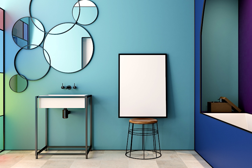
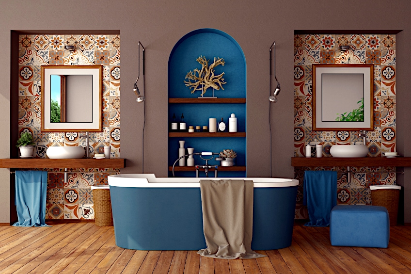
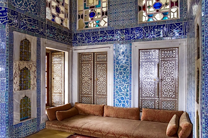
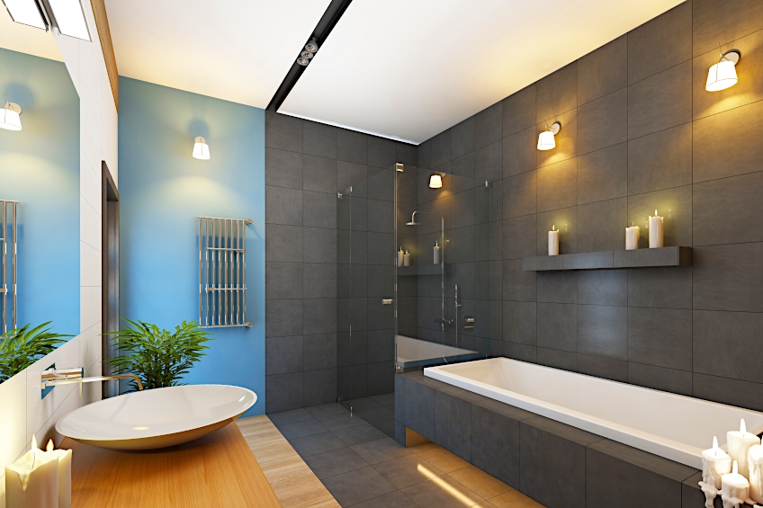
Using blue in the bathroom is a classic choice. The color evokes images of water and can be incredibly soothing. Light blue walls and a white sink, bath, or shower with bright lighting can create a really clean look. However, if this sounds too mundane you could always spice up your bathroom with white-washed walls and some blue and white patterned tiles. This will give it a Mediterranean feel.
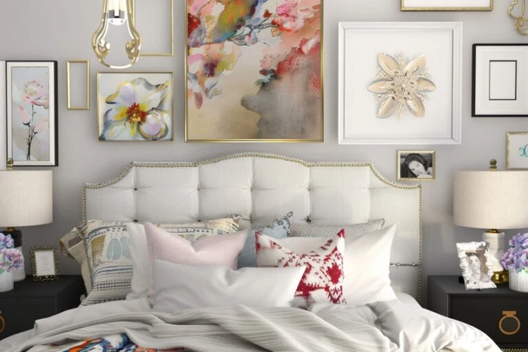
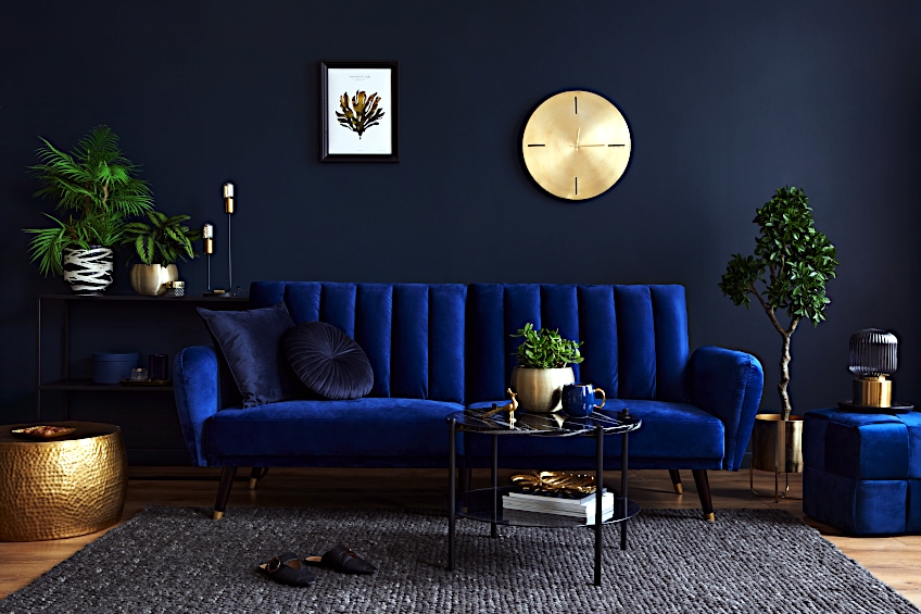
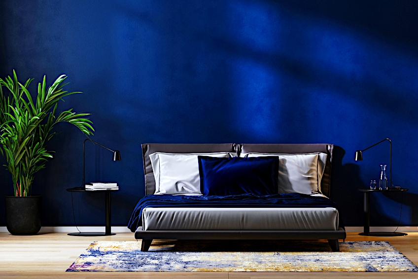
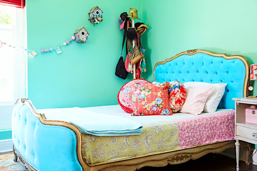
Finally, blue can be a great color for your bedroom too. To create a sophisticated, luxurious feeling make use of dark colors like navy. Although this can give your room a cozy atmosphere, it is essential to take note of your lighting when using dark colors. Introduce light through large windows, lamps, or hanging lights. Using lots of texture, metallic accents and varying levels can add life to a dark color palette. If you are not a fan of dark bedrooms you can still follow a blue color scheme. In this case, make use of pale blues and other pastel colors to create a dreamy feel.
Here are some general rules to follow when decorating your home. They have been tried and tested by interior designers for years. However, even though it can be helpful to listen to the experts remember that these are just guidelines and that at the end of the day it is your home, and you should do what feels right to you.
- Stick to colors within the same color family in open-plan spaces. When you can see different rooms in the house from each other it is best to decorate them with colors from the same families. For example, when using blue you should stick to shades within that, such as navy, sky blue, or blue-gray. You could then pair these with a complementary color of blue, like orange, within which you could use rusts, peaches, or amber tones.
- Too many bright colors can be tiring. When you look at bright colors your brain becomes stimulated. When there is too much for your brain to look at it can be draining. Therefore, in order to create a calming environment, stick to more muted tones. If you do want to use bright colors, stick to one or two to keep it interesting but not overwhelming. Keep this in mind when using patterns too. In this case, it is best to go for a monochromatic look to avoid it looking too chaotic.
- Remember that color adds to the illusion of size and weight. Paler colors tend to make an object look lighter and smaller, whilst darker colors do the opposite. If you have a small space, filling it with large, dark furniture can make it look even smaller and more crowded. On the other hand, light small furniture in a large room can make your space look minimalistic. Keep in mind the effect of color on weight and size when choosing the best color scheme for your home.
- Dark colors are suited to private areas of the house whilst light colors are more suitable for social spaces. Using a darker color palette in intimate rooms, such as bedrooms and studies, can make them feel comfortable and snug. However, in spaces that are intended to entertain or to have many people in them at once, this can feel stifling. For these areas, such as living rooms, kitchens, and dining rooms, opt for lighter, airier colors.
- Use art to enhance your color scheme. Art is an easy way to tie all of your colors together. When it comes to blue decor, you may want to incorporate a few accent colors for blue, like yellow or pink. You can then hang pieces of art on your wall that contain bits of blue and your chosen accent color. This makes for a very subtle but put-together look.
Blue and White
When thinking of what colors go with blue this is one of the first combinations that comes to mind. That is because blue and white used in decor make for a clean and classic look. This color combination calls to mind nautical themes and is very popular in coastal interior design. However, you don’t have to be near the sea to pull off this serene aesthetic in your home.
Blue and white bring a really airy, relaxing feel to a room. That’s why it is such a good combination to use particularly in bedrooms and bathrooms. Because this color combination is so simplistic keep it interesting by playing with patterns and textures. Wooden flooring can bring some warmth to this cool combination to stop it from feeling too clinical.
| Shade | Hex Code | CMYK Color Code (%) | RGB Color Code | Color |
| Navy Blue | #000080 | 240, 100, 25 | 0, 0, 128 | |
| Off-White | #FAF9F6 | 250, 249, 246 | 45, 29, 97 |
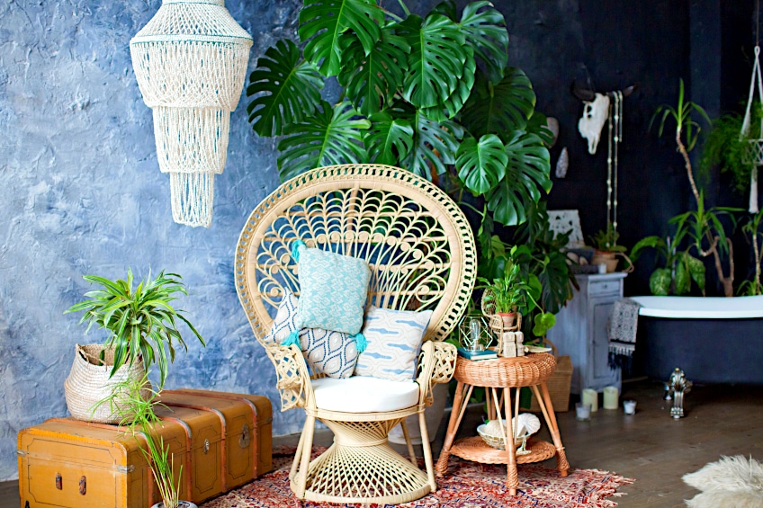
Blue and Green
When unsure about colors that complement blue turn to nature. Our entire planet is a combination of blue and green, so that has to count for something. Blue and green are also analogous colors and so create a harmonious color scheme when used together. Due to the great variety of hues that both colors possess there are countless looks that can be created using blue and green.
For a bright and bold look combine shades like turquoise and apple green. This combination is fresh and surprisingly warm for a palette combining two cool colors. If this combination does not appeal to you, go for a moodier look created with mossy greens and midnight blues. Green is also one of the easiest accent colors for blue. Try out the combination by adding houseplants to your blue decor.
| Shade | Hex Code | CMYK Color Code (%) | RGB Color Code | Color |
| Aqua | #00FFFF | 180, 100, 50 | 0, 255, 255 | |
| Grass Green | #7CFC00 | 90, 100, 49 | 124, 252, 0 |
Blue and Gray
Gray is one of the colors that go with blue effortlessly. Many shades of gray have small amounts of blue pigment in them already, making it almost as easy as creating a monochromatic look. The only issue that could arise from this color combination is that it could make a space look too cold. However, this is a really easy mistake to avoid.
When certain blues are combined with a warm, earthy shade of gray like stone, it creates a similar look to using an all-neutral color palette. Combining shades like denim blue and taupe creates a beautiful base that can be left as is, or can have small pops of color added to it through ornaments or cushions.
| Shade | Hex Code | CMYK Color Code (%) | RGB Color Code | Color |
| Denim Blue | #6F8FAF | 210, 29, 56 | 111, 143, 175 | |
| Smoke | #848884 | 120, 2, 53 | 132, 136, 132 |
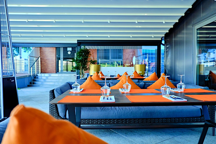
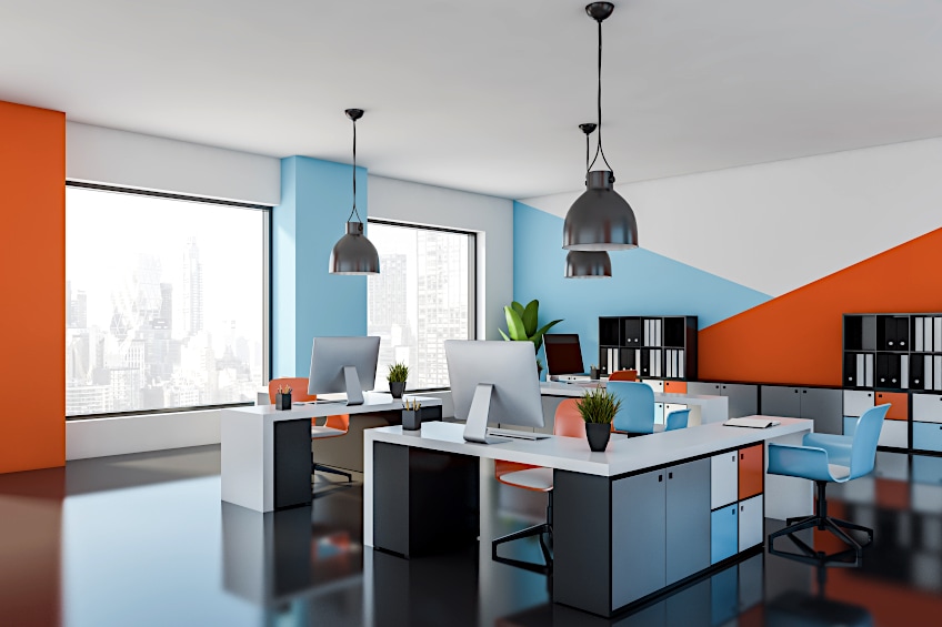
Blue and Orange
Orange is a complementary color of blue, meaning they are scientifically proven to be a good color combination. The mixture of cool blue tones with warm orange ones makes for a very balanced look. Although this combination would work in any room of the house it is particularly well-fitted for social spaces like the kitchen and living room as it creates an energetic atmosphere.
For a vibrant, arty look combine shades of robin egg blue and burnt orange. This can be done for example, through a blue wall and orange couch combination, with a more neutral flooring to keep it balanced. Another more muted take on these complementary colors could be using a color scheme of teal, peach, and once again, a neutral. Even just using blue and orange accents in a neutral room can really add interest.
| Shade | Hex Code | CMYK Color Code (%) | RGB Color Code | Color |
| Robin Egg Blue | #96DED1 | 169, 52, 73 | 150, 222, 209 | |
| Burnt Orange | #CC5500 | 25, 100, 40% | 204, 85, 0 |
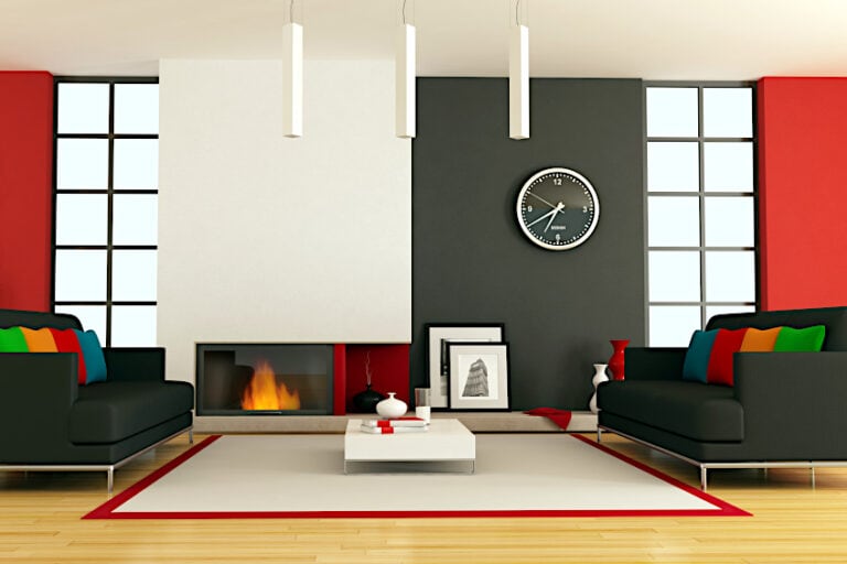
Blue and Red
Blue and red are both primary colors which is why they look so nice together. They are also a color combination that makes use of cool and warm tones. Red is a very bold, in-your-face color and so using a calming color like blue can stop it from looking too much. This is also a versatile color combination that can be used to create modern or traditional interiors.
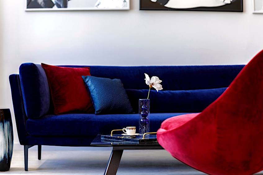
For a modern look combine bold blues and reds with neutrals like gray and white to tone them down. Another take on this same color palette is using lighter blues and reds with neutrals for a softer look. These are more fitting to spaces like bedrooms and bathrooms that require more relaxed atmospheres. For a traditional, sophisticated take on blue and red, go for darker shades like navy and maroon paired with dark wood flooring and leather furniture.
| Shade | Hex Code | CMYK Color Code (%) | RGB Color Code | Color |
| Navy Blue | #000080 | 240, 100, 25 | 0, 0, 128 | |
| Burgundy | #800020 | 128, 0, 32 | 345, 100, 25 |
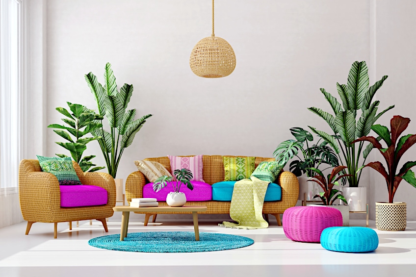
Blue and Pink
Blue and pink is a color combination that has become increasingly popular in recent years. This is probably due to the fact that it is a more muted take on blue and red but with the same benefits as the warm- and cool-toned combination. This color combination is well suited to any room of the house. It can be vibrant and fun for spaces like the living room or kitchen, or it can be soft and whimsical for spaces like bedrooms and bathrooms.
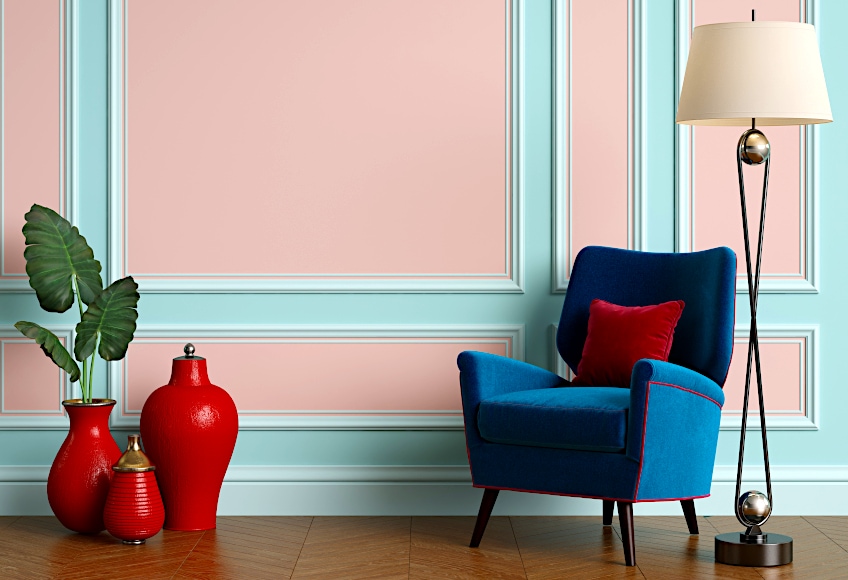
For an eye-catching yet not too overpowering look, combine deep blues with blush pinks. Pairing this color combination with a mix of light and dark neutrals can prevent it from looking too soft. Incorporating pops of green by adding houseplants to the room also makes for a wonderful color composition. For a softer take on this color combination, try going for shades of baby blue and pink, combined with light, airy neutrals and even accents of pastel yellow.
| Shade | Hex Code | CMYK Color Code (%) | RGB Color Code | Color |
| Cobalt Blue | #0047AB | 215, 100, 34 | 0, 71, 171 | |
| Pink | #FFC0CB | 350, 100, 88 | 255, 192, 203 |
Blue and Yellow
Blue and yellow are a match made in heaven. They are both primary colors that can be used together to create a high-contrast look. The mixture of cool and warm tones creates the perfect interior that is not too cool and not too warm. Use a combination of blue and yellow to achieve subtle or stunning looks for any room of the house.
Yellow is a very stimulating color, so in order to stop it from stealing the show, it is advisable to use more blue than yellow in your decor. Even just using yellow as an accent color for blue will create a big impact. For an even more subtle look opt for gold or brass details instead of a true yellow. Pairing this color combination with light and earthy neutrals also prevents it from being too strict.
| Shade | Hex Code | CMYK Color Code (%) | RGB Color Code | Color |
| Sapphire Blue | #0F52BA | 216, 85, 39 | 15, 82, 186 | |
| Brass | #E1C16E | 43, 66, 66 | 225, 193, 110 |
Blue and Beige
Blue and beige are a very soothing color combination. Think beautiful blue waves crashing on soft, beige sand. Today’s society is so fast-paced that having a relaxing space to come home to is essential. This is also not a combination of colors that will go out of fashion, which means your space will never look dated.
This is one of those cases in which blue almost becomes neutral. Therefore, pair your blue and beige combination with a number of other neutrals to create a well-rounded look. To keep your space from looking boring, really play up your simple color scheme with a variety of different textures and patterns. If you start to feel as though you want a bit more color in your home, then blue and beige allow for the perfect base to which you can introduce a few accent colors.
| Shade | Hex Code | CMYK Color Code (%) | RGB Color Code | Color |
| Baby Blue | #89CFF0 | 199, 77, 74 | 137, 207, 240 | |
| Ecru | #C2B280 | 45, 35, 63 | 194, 178, 128 |
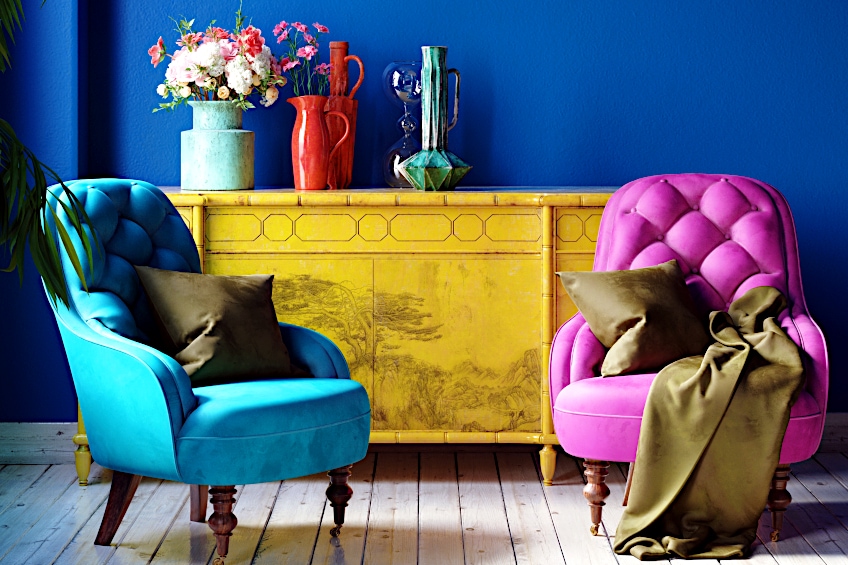
Blue and Purple
Blue and purple are analogous colors, which is why they work so well to create a coordinated space. This color combination can be used to achieve a calming, cool look by using a more blue- toned purple. Otherwise, a more red-toned purple can be used to add warmth to a space. Blue and purple is quite a unique combination to use in your home, but if done correctly, it can be very beautiful.
For a polished, luxurious feel combine jewel tones of plum and sapphire with dark wood flooring and velvety textures. A color palette such as this is best suited to personal spaces, such as bedrooms and reading nooks as it creates an inviting atmosphere. For a higher contrast, try pairing navy and lilac shades with earthy neutrals. Finally, if you’re wanting something bright and vivid, look no further than the primary colors of pigment, which include cyan and magenta. As these are very bright, it is best to use them as furnishings rather than as wall paint.
| Shade | Hex Code | CMYK Color Code (%) | RGB Color Code | Color |
| Cyan | #00FFFF | 0, 255, 255 | 180, 100, 50 | |
| Magenta | #FF00FF | 300, 100, 50 | 255, 0, 255 |
Blue and Brown
Brown is one of the colors that complement blue in such a subtle yet effective way. This color combination can be used to create a bright, airy atmosphere or a comfortable and cozy space. It is such a chic and versatile combination that it can easily be used to decorate any room of your home.
To add a relaxing, timeless feel to your interior decor, try using a combination of slate blue walls, gray or beige couches, or bedding, and wooden flooring to incorporate the brown. For a more obvious use of the color combination, swap the color scheme of the furnishing and flooring. In other words, try combining a chocolate brown or leather couch with white or gray flooring. For a richer, more sophisticated interior, combine darker shades of blue like midnight and navy with dark wood and leather. Bring some warmth and light into the room by installing brass hanging lights.
| Shade | Hex Code | CMYK Color Code (%) | RGB Color Code | Color |
| Glaucous | #6082B6 | 216, 37, 55 | 96, 130, 182 | |
| Coffee | #6F4E37 | 25, 34, 33 | 111, 78, 55 |
Need some peace and tranquility in your home? Then it’s time to start incorporating blue into your interior design. Blue is a very easy color to match with other colors. Even if you are not an expert at interior design, you will be able to introduce it into your home in a way that looks effortless and cohesive. Use combinations of blue in all rooms of your home to give it a unified feel.
Frequently Asked Questions
What Colors Go With Royal Blue?
The following colors all look great when combined with royal blue: gray, yellow, off-white, green, hot pink, and gold. Royal blue is not too vibrant, which makes it an easy color to use as a base to add either neutrals or pops of color to.
How Do You Brighten Up a Blue Room?
If your blue room is feeling too dark and claustrophobic, there is an easy solution to this. By adding lighter blue shades and whites, you can brighten up any blue. Typically, introducing any light neutrals to a space will tone it down. You can even use yellow as an accent for blue to add warmth to it.
Is Blue a Neutral Color?
Blue is used as a neutral color every day in the fashion world, which is one of the reasons as to why jeans will never go out of fashion. So why not apply this same principle to your home? The reason denim can be used as a neutral color is that it is a mixture of blue and white threads. Therefore, by pairing blue with white in your decor, you can pair it with any color. Be sure to choose a blue that is not too vivid when using it as a neutral though.